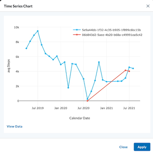
Time Series Chart
A Time Series module allows users the option to graph their data over time in a bar or line chart. Once parameters of your graph are set, a toggle switch lets you decide between line or bar chart to be displayed.
Module Settings
Once you add a time series module to your layout, you'll enter the module settings where you can set the parameters for the data you wish to display.
The most common selection for each parameter is selected by default.
General
- Title - Give the graph a name (default is Time Series Chart)
- Graph As - Toggle between Line or Bar (as shown in clip above)
- Time Axis - These are time related
- Label - Name what is being graphed along the x-axis
- Time Series Resource - Select between:
- Calendar Date
- Time Series Interval (Day, Month, Year)
- Medications/ Procedures/ Observations/ Conditions
- Time Series Interval (Day, Month, Year)
- Interval-Code Relation:
- Before First Occurrence Of Code
- Before Last Occurrence Of Code
- After First Occurrence Of Code
- After Last Occurrence Of Code
- Search box - To search for the Medications/ Procedures/ Observations/ Conditions
- Calendar Date
Medications, Procedures, Observations, and Conditions are useful selections if you wish to align all patients relative to a certain start date, such as when they first started participating in a clinical research study.
Calendar Date is a useful selection when looking at a specific start date, such as viewing how many patients reported depression since the COVID lockdown began.
- Y-Axis Values
-
Label - Name what is being graphed along the y-axis.
-
Data type
- Select from:
- Medications
- Procedures
- Observations
- Conditions
- Search box - Click or type the name of the resource you wish to graph.
- Property - Choose from Patient Count or Record Count.
- Function - Choose from Count Percent or Count Total.
- Select from:
-
Date Filter - If you leave this blank, it will show the data collected since being recorded.
- Start Date (type or click calendar to set date) - Clicking the checkbox beside Relative will change this to a box where you can specify the the number of days (After Days Ago from today - For example, a week ago would be 7 in the After Days Ago box and 0 in the Before Days Ago box).
- End Date (type or click calendar to set date) - Clicking the checkbox beside Relative will change this to a box where you can specify the the number of days (Before Days Ago from today).
-
Group Series Data - Here you can toggle on to Group the series by patients, meaning you can see each individual patient's data on a separate line in the same graph.
-
Cohort Comparision - Select up to four cohorts to compare (if cohorts have been created for the project). The bars of your chart split to represent the different cohorts in the given module.
-
The cohort selector in the header overrides the selection in the module settings. However, the header's cohort selecttion cannot be saved and is just a temporary view.
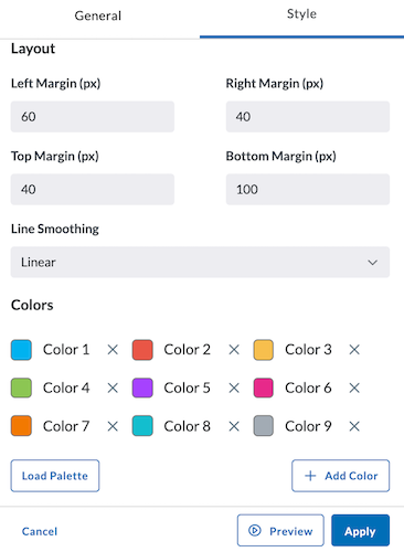
Style
The Style tab allows you to adjust the colors of your bar or line chart as well as adjust the smoothing of your line. You can also load a palette for more color options. Margin sizing for your module can also be adjusted here.
After making adjustments, preview, apply, and save your new settings:
- Click Preview in the module settings to view it.
- If everything looks good, click Apply to apply the new settings. This will NOT save the module. If you click away, you will lose this module.
- To save this module and its settings to the layout, click the Save Changes icon found in the header at the top of the page. Or if you need to make changes, click the Edit icon in the top right corner of the module.
Clicking Apply will create your chart. It does not save the layout. To save the layout, you must click the Save Changes icon (found in the header). Navigating away from this page before clicking the icon will cause you to lose all changes since your last save.
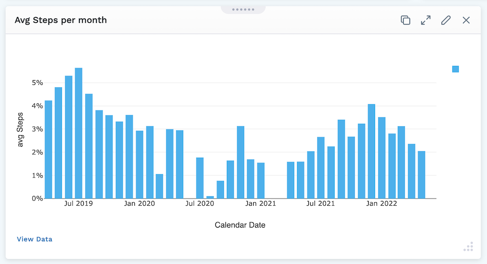
Viewing the Time Series Chart
Plotly graphs in the LifeOmic Platform have a mode bar of tools to improve the ease of viewing the displayed data (shown below).
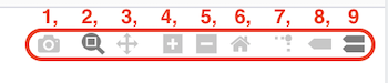
The Time Series Mode bar graph tools include:
- Download plot as a PNG.
- Zoom - Zooming can be performed vertically and horizontally. If graphs are stacked, only the one you zoomed in will change. When graphs are layered, all will zoom in. Double clicking within the part you zoomed will reset the vertical.
- Pan - Lets you grab and drag the plot to change the date range seen.
- Zoom in - Lets you zoom in.
- Zoom out - Lets you zoom out.
- Reset axes - Lets up zoom to include your Axes Range, if this has been set. If it has not been set it zooms to a setting that shows all the viewable data.
- Toggle spike lines – When you hover, this drops a dotted line to the x and y axis to see where it lands.
- Show closest data on hover – Shows the one data point you are closest to.
- Compare data on hover – Shows all data points when you hover, if you toggle that off you’ll see the single data point that you are closest to.
You can click on a point or a selection of points, then click View Data in the bottom left of the module to see the data affiliated with it in table format. This View Data page also can be viewed full screen by clicking the icon in the top right of the window.