Pie Chart
Pie Charts are only used for patient demographics.
Add a Pie Chart to Your Layout:
- If you are not already in Edit Layout mode, enter it by clicking the Edit Layout icon in the header.
- Click the Add Module button at the bottom right of the screen.
- Select Pie Chart.
- In the window that opens, three tabs are available to customize your pie chart: General, Style, and Advanced.
General
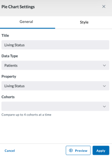
Title - Name the pie chart to reflect what the chart will represent.
Data Type (select from):
- Patients:
- Property:
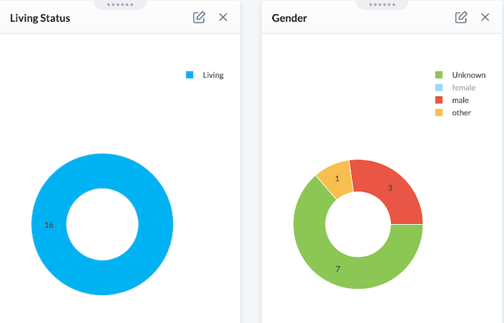
- Race
- Gender
- Living Status
- Ethnicity
- Property:
- Observations (click to view or start typing to search observations):
- Date Filter
- Start Date (type or click calendar to set date) - Clicking the checkbox beside Relative will change this to a box where you can specify the number of days (After Days Ago)
- End Date (type or click calendar to set date) - Clicking the checkbox beside Relative will change this to a box where you can specify the number of days (Before Days Ago)
- Cohort Comparision - Select up to four cohorts to compare (if cohorts have been created for the project). The bars of your chart split to represent the different cohorts in the given module.
- Date Filter
- Conditions, Procedures, and Medications have similar parameters to set (click the search box to type or scroll through conditions)
- Property: Choose between Patient Count or Record Count
- Date Filter
- Start Date (type or click calendar to set date) - Clicking the checkbox beside Relative will change this to a box where you can specify the number of days (After Days Ago)
- End Date (type or click calendar to set date) - Clicking the checkbox beside Relative will change this to a box where you can specify the number of days (Before Days Ago)
- Cohort Comparision - Select up to four cohorts to compare (if cohorts have been created for the project). The bars of your chart split to represent the different cohorts in the given module.
- Property: Choose between Patient Count or Record Count
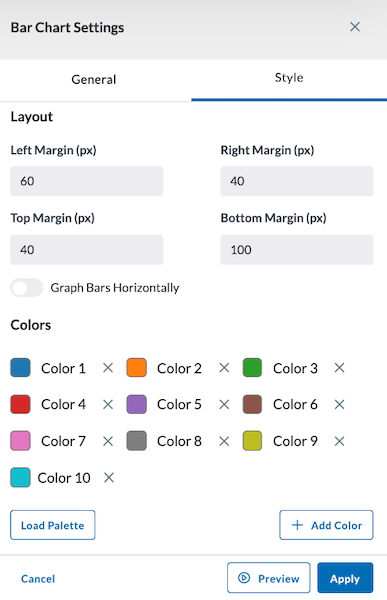
Style
The Style tab allows you to adjust the colors of your bar chart and select the margin size of your module. You can also load a palette for more color options.
Preview, Apply, and Save your new settings:
- Click Preview in the module settings to view it.
- If everything looks good, click Apply to apply the new settings. This will NOT save the module. If you click away, you will lose this module.
- To save this module and its settings to the layout, click the Save Changes icon found in the header at the top of the page. Or if you need to make changes, click the Edit icon in the top right corner of the module.
Clicking Apply will create your chart. It does not save the layout. To save the layout, you must click the Save Changes icon (found in the header). Navigating away from this page before clicking the icon will cause you to lose all changes since your last save.
Viewing Pie Chart Data
To view data for a wedge of the pie chart, click on a wedge to see the data affiliated with that data in table format.
To view data for all subjects in the pie chart, either:
- Click the View Data button on the bottom left of the module.
- Click on a wedge of the pie chart, then click the All Subjects tab at the top of the View Data screen that opens.
This View Data page also has other tools such as exporting that data, seeing it full screen, opening other data views, as well as creating, adding to, or removing the subject from a cohort. You can view more information on this in the View Data section of the User Guide.