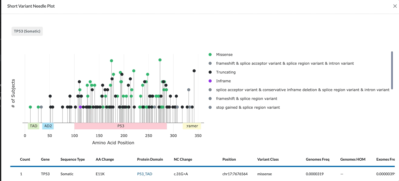
Short Variant Needle Plot
The Short Variant Needle Plot looks at a specific gene and a specific variant type (somatic or germline) across all subjects in your project.
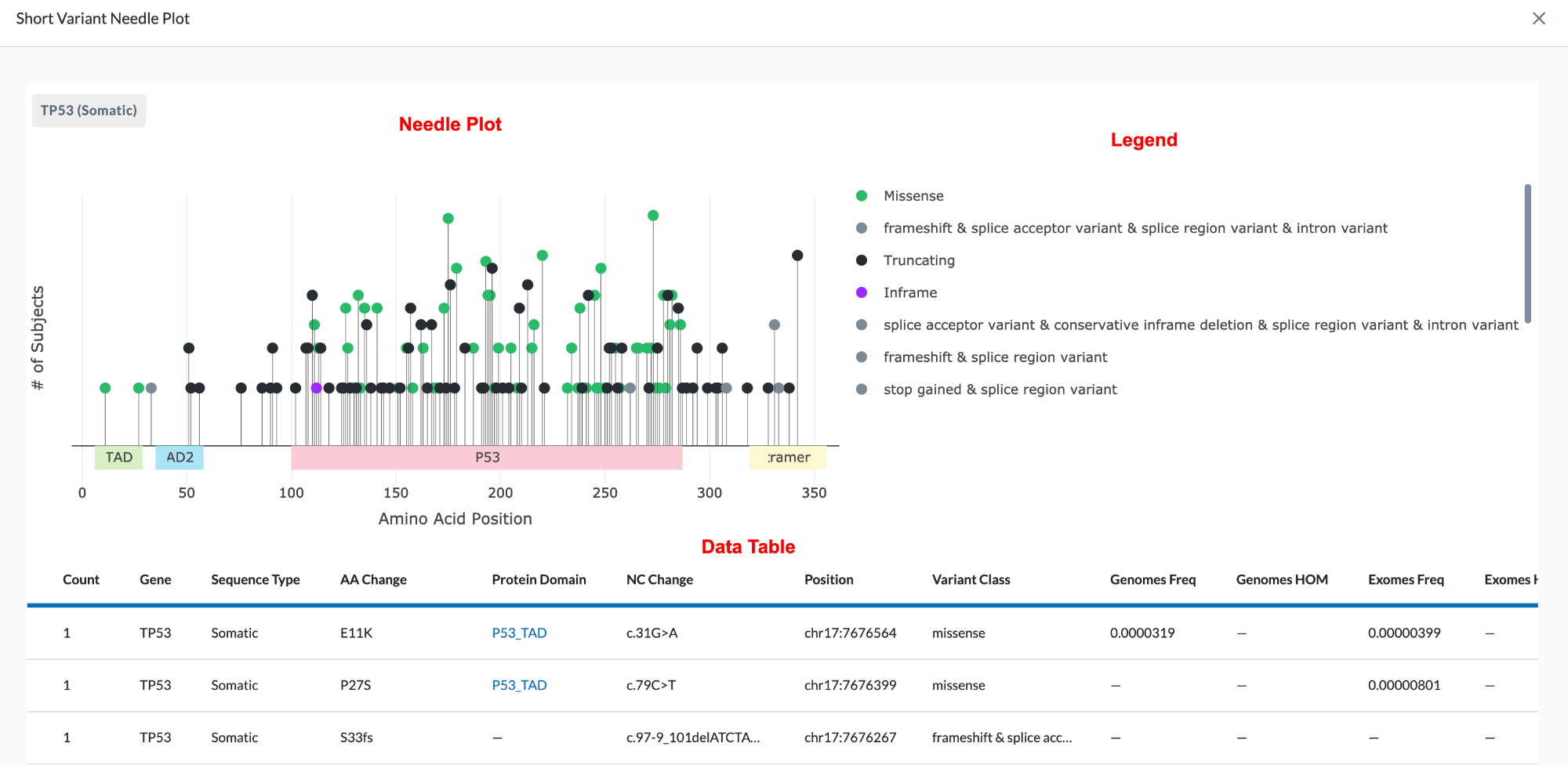
The name of the gene being plotted is located in the top left of the module. Beneath it is the Needle Plot and Legend, followed by the data table which provides more detail for the variant.
Add a Short Variant Needle Plot to Your Layout:
-
If you are not already in Edit Layout mode, enter it by clicking the Edit Layout icon in the header.
-
Click the Add Module button at the bottom right of the screen.
-
Select Short Variant Needle Plot.
-
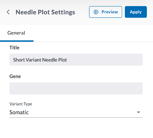
In the window that opens, begin setting your parameters for the Needle Plot.
-
Give the Graph a title.
-
Specify the Gene you wish to plot, using all caps.
-
Specify Somatic (tumor-based) or Germline (inherited).
-
Click Preview.
-
If everything looks correct, click Apply
Clicking Apply will create your needle plot. It does not save the layout. To save the layout, you must click the Save Changes icon (found in the header). Navigating away from this page before clicking the icon will cause you to lose all changes since your last save.
Viewing the Short Variant Needle Plot
Hovering your cursor in the top right of the Needle Plot module will pull up the Plotly Mode Bar with tools to help you view the Needle Plot.
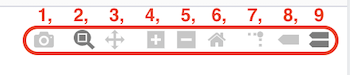
The Mode Bar tools shown above include:
- Download plot as a PNG
- Zoom - Zooming can be performed vertically and horizontally. If graphs are stacked, only the one you zoomed in will change. When graphs are layered, all will zoom in. Double clicking within the part you zoomed will reset the vertical
- Pan - lets you grab and drag the plot to change the date range seen
- Zoom in - lets you zoom in
- Zoom out - lets you zoom out
- Reset axes - lets up zoom to include your Axes Range, if this has been set. If it has not been set it zooms to a setting that shows all the viewable data.
- Toggle spike lines – when you hover, this drops a dotted line to the x and y axis to see where it lands
- Show closest data on hover – shows the one data point you are closest to
- Compare data on hover – shows all data points when you hover, if you toggle that off you’ll see the single data point that you are closest to
X-Axis:
The X-Axis represents the amino acid position. The different protein domains are shown in different colored bars along the X-axis. Hovering over these domains will give you the full name of the domain (as shown in the clip below). The numbers beneath the protein domains indicate where that part of the domain is found.
Y-Axis:
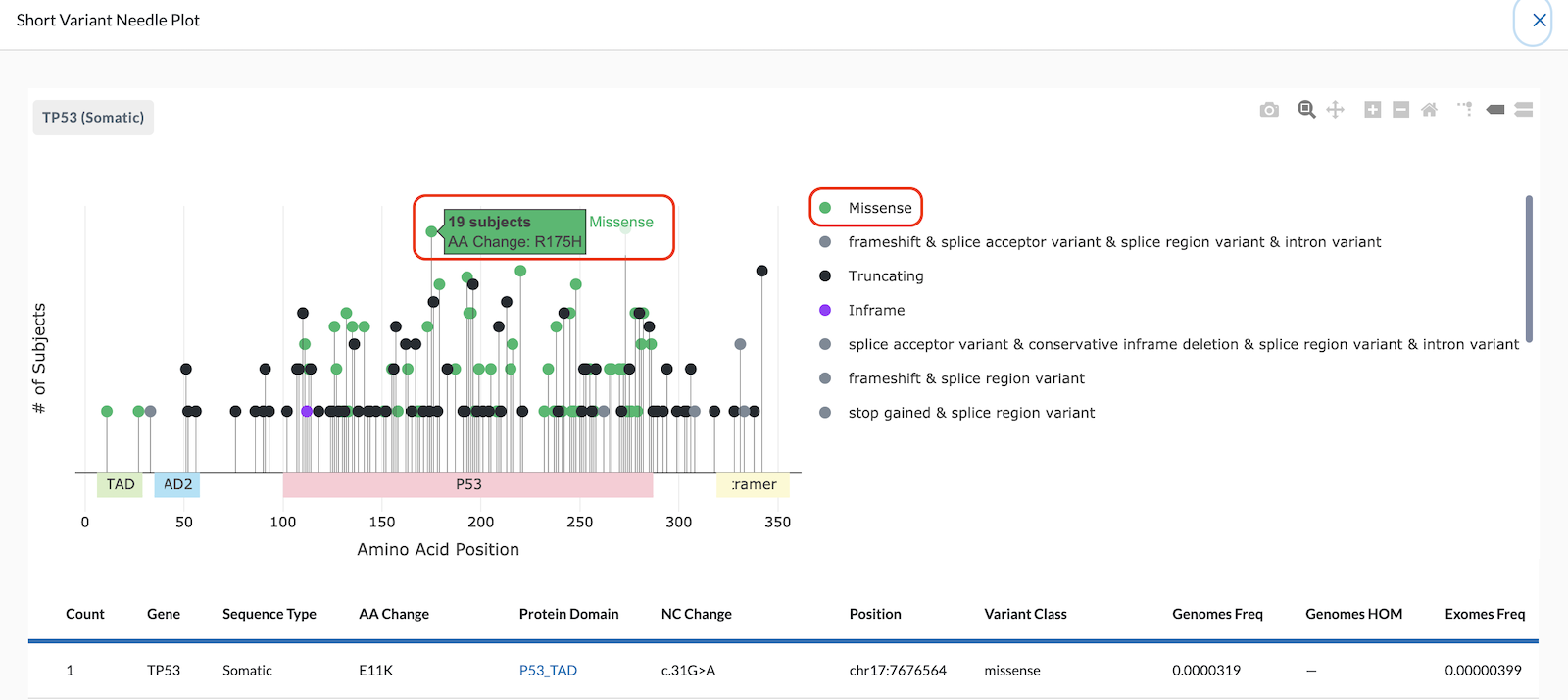
The Y-Axis of the Needle Plot shows the number of subjects in your project with this variant. The height of the needle reflects the amount of subjects with this variant, so a taller needle means more subjects have that variant.
Note: The y-axis currently is on a logarithmic scale, not linear.
Hovering over a needle head will tell you the number of subjects, along with the amino acid change. In the image below, the needle plot shows 19 subjects have a R175H Missense Amino Acid change.
Multiple Changes on a Single Needle:
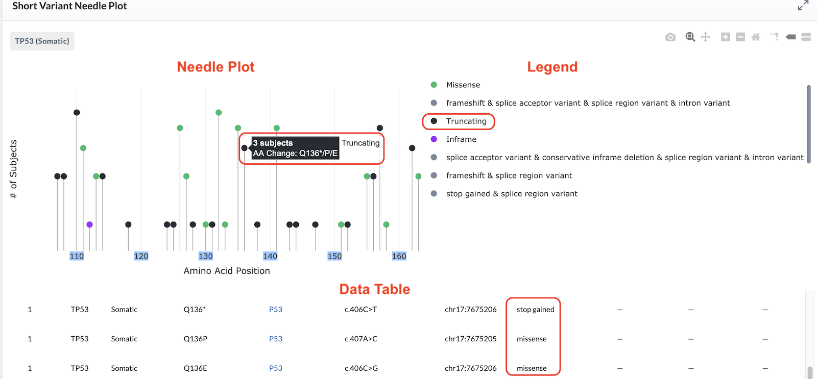
All variant changes affecting the same amino acid position are plotted on the same needle and are called out in the banner displayed when you hover on it (as shown in the image below). However, the data table beneath the plot has a separate row for each variant based on amino acid change, nucleotide change, and genomic position.
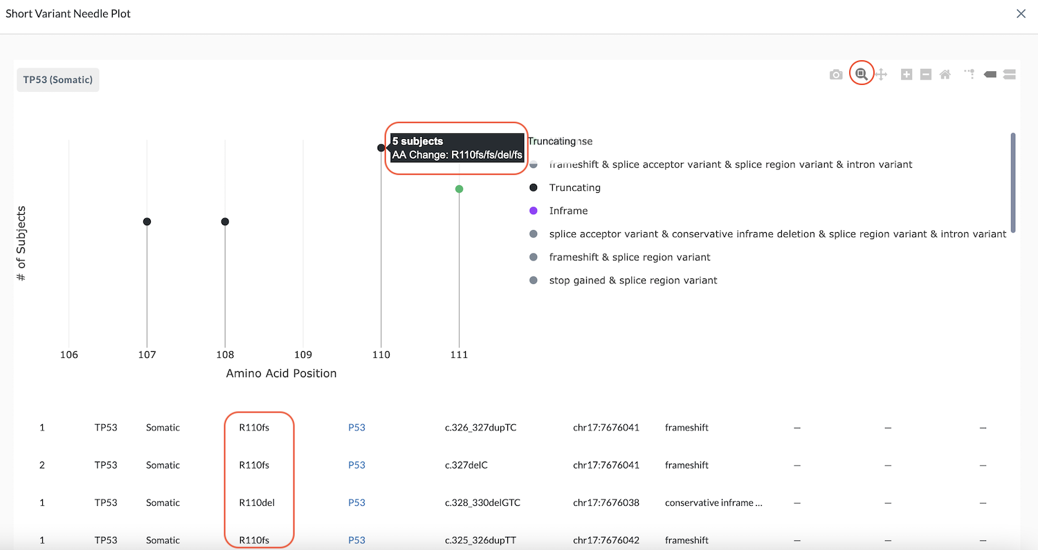
In the example above, the banner reads, "5 subjects, AA Change: R110fs/fs/del/fs". These are different changes at the exact same location. The data table beneath the plot shows more detail of each. Notice that while the banner reads "five subjects", only four entries are listed in the table. This is because two subjects have the same variant change (noted by the number two in the Count column on the left).
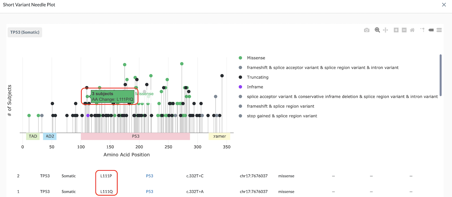
In the example below, the needle banner says, "3 subjects, AA change: L111P/Q" and the data table shows two subjects with L111P and one subject with L111Q.
Legend
The legend associates the needle head color to the variant impact. You can click on a protein impact in the legend to view or hide the needles corresponding with it (as shown in the clip below). Likewise, the protein domains are also available if you scroll in the legend. These can be clicked to highlight the section of the plot that corresponds with that domain.
The most harmful protein effect of those listed on a single needle dictates the color of the needle head and is displayed first in the needle's hover banner.
In the example below, the banner reads, "AA Change: Q136*/P/E". The table beneath the plot tells us the Q136* is a stop gained variant which is more damaging than the other two missense variants. Therefore, the truncating or stop gained variant is displayed first in the banner and dictates the color of the needle head.