Bar chart
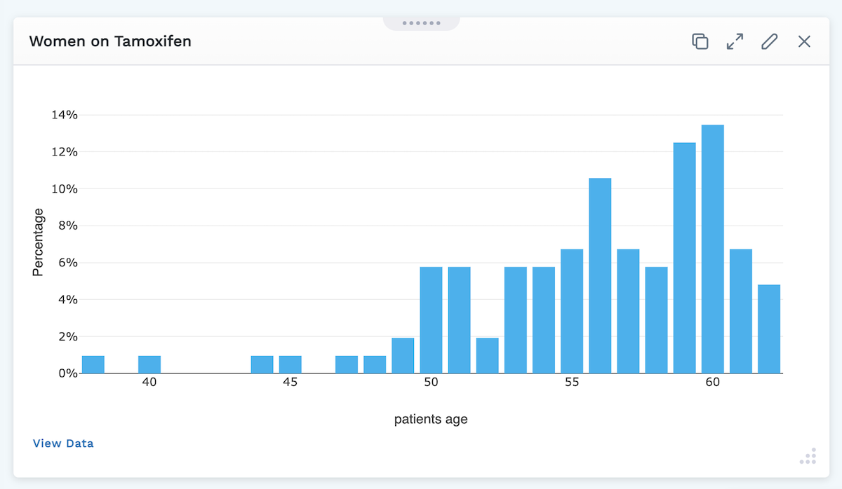
Bar charts are used to compare categories of data. For instance, we can compare the percentage of women of each age in our patient population who are using the drug tamoxifen.
The data requested to build the chart will vary based on the data type you wish to graph (medications, procedures, observations, and so on).
The most common selection for each parameter is selected by default.
Add a Bar Chart to Your Layout:
-
If you are not already in Edit Layout mode, enter it by clicking the Edit Layout icon in the header.
-
Click the Add Module button at the bottom right of the screen.
-
Select Bar Chart.
-
In the window that opens, two tabs are available to customize your Bar Chart: General and Style
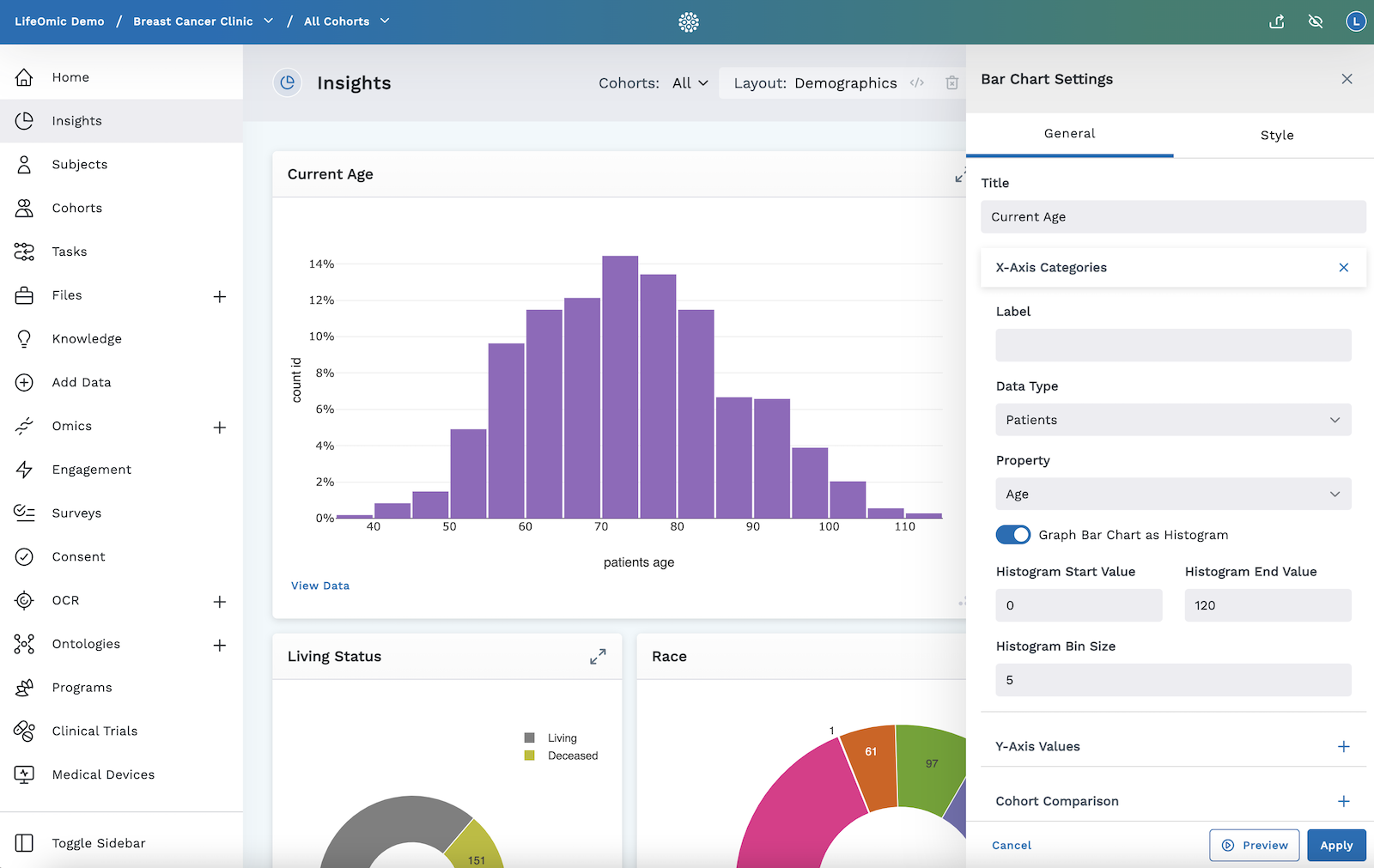
General
Title - Give your bar chart a name. This will be displayed on the top left of this module within the layout (optional).
X-Axis Categories
-
Label - Tell what you are grouping by or what we want the columns to represent.
-
Data Type - Select one of the following from the dropdown menu (parameters vary depending on data type):
-
Medications
- Use the Search box to further filter your selection - your selection will show up as a chip beneath the search bar
- Specify the sort order (Descending or Ascending)
- If the value is numeric, you can toggle on Graph Bar Chart as Histogram (optional)
- Give Histogram Start Value (number you want to start counting, such as weight starting at 80lbs)
- Give Histogram End Value (number you want the count to end on, such as, show max weight 500lbs)
- Specify Histogram Bin Size (intervals you want to count by, such as show weight in increments of 10's)
-
Procedures
- Use the Search box to further filter your selection - your selection will show up as a chip beneath the search bar
- Specify the sort order (Descending or Ascending)
- If the value is numeric, you can toggle on Graph Bar Chart as Histogram (optional)
- Give Histogram Start Value
- Give Histogram End Value
- Specify Histogram Bin Size
-
Observations (such as lab values, app data, questions, and survey data)
- Use the Search box to further filter your selection - your selection will show up as a chip beneath the search bar
- Specify the Property (Value or Records)
- Specify your Subset (All, First Occurrence of Code, or Last Occurrence of Code)
- Specify the Sort Order (Descending or Ascending)
- If the value is numeric, you can toggle on Graph Bar Chart as Histogram (optional)
- Give Histogram Start Value
- Give Histogram End Value
- Specify Histogram Bin Size
- If the value is numeric, you can toggle on Graph Bar Chart as Histogram (optional)
-
Patients
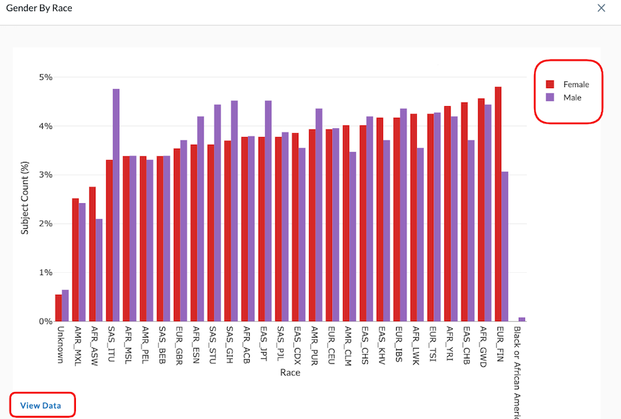
- Select the Property you wish to Group by: Age, Gender, Race, Ethnicity, or Patient
- Select Sort Order (Descending or Ascending
)
- If the value is numeric, you can toggle on Graph Bar Chart as Histogram (optional)
- Give Histogram Start Value
- Give Histogram End Value
- Specify Histogram Bin Size
-
Conditions
- Use the Search box to further filter your selection - your selection will show up as a chip beneath the search bar
- Specify the sort order (Descending or Ascending)
-
Gene Expression
- You can toggle on Choose specific genes, if toggled on, you'll be asked for further information (multiple can be graphed by clicking the Add Gene button):
- Toggle to select specific genes as:
-
gene set (then click on the Gene Set dropdown menu to select a set)
-
genes (then type the gene(s) you want to graph, using a comma to separate the genes)
-
- Toggle to select specific genes as:
- You can toggle on Choose specific genes, if toggled on, you'll be asked for further information (multiple can be graphed by clicking the Add Gene button):
-
Y-Axis
-
Label - Give a label to what is graphed on the vertical axis.
-
Data Type
-
Procedures, Conditions, or Medications - Click in the search box to find the medication you wish to graph (only one selection allowed)
-
Property - Choose from:
- Record Count
- Count of Patients
-
Function - Select from:
- Count (Total)
- Count (Percent)
-
Observations - Click in the search box to find the medication you wish to graph (only one selection allowed)
-
Property - Choose from:
- Record Count
- Count of Patients
- Value (You can also toggle the Graph with Standard Deviation switch on to display this on the graph)
-
Function - Select from:
- Count (Total)
- Count (Percent)
-
Patient Count - Select the function:
- Count (Percent)
- Count (Total)
-
-
Date Filter
- Start Date (type or click calendar to set date) - Clicking the checkbox beside Relative will change this to a box where you can specify the the number of days (After Days Ago)
- End Date (type or click calendar to set date) - Clicking the checkbox beside Relative will change this to a box where you can specify the the number of days (Before Days Ago)
-
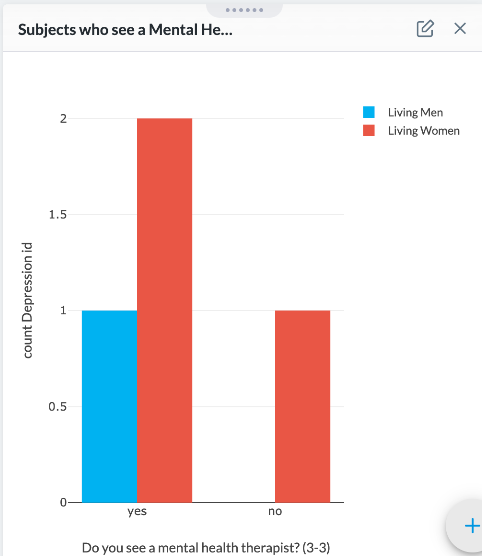
Cohort Comparision - Select up to four cohorts to compare (if cohorts have been created for the project). The bars of your chart split to represent the different cohorts in the given module.
Setting a Cohort Comparison within a module keeps the comparison specific only to this module and remains here until you remove it. But using the cohorts expansion icon in the header applies the cohort comparison to all modules in the layout and resets when you click away from the screen. Click here for more information on Cohorts.
The header Cohorts selector overrides the Cohort Comparison module selection. Only a layout administrator can modify the cohorts in the module settings, where any user can modify the Cohorts using the header Cohorts selector.
In the image below, we selected Cohort 1 = Living Men and Cohort 2 = Living Women. By doing this, we can compare how many living men vs. women see a Mental Health Therapist. The graph reflects that of the four subjects in our project, one man and two women see a Mental Health Therapist and only one woman does not.
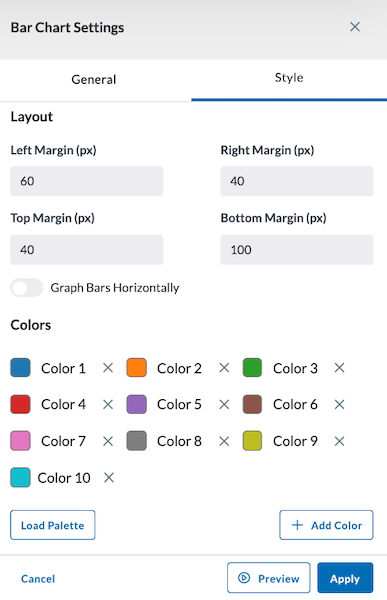
Style
The Style tab allows you to adjust the colors of your bar chart and select the margin size of your module. You can also load a palette for more color options.
Preview, Apply, and Save your new settings:
- Click Preview in the module settings to view it.
- If everything looks good, click Apply to apply the new settings. This will NOT save the module. If you click away, you will lose this module.
- To save this module and its settings to the layout, click the Save Changes icon found in the header at the top of the page. Or if you need to make changes, click the Edit icon in the top right corner of the module.
Clicking Apply will create your chart. It does not save the layout. To save the layout, you must click the Save Changes icon (found in the header). Navigating away from this page before clicking the icon will cause you to lose all changes since your last save.
Viewing Bar Chart Data
You can click on a single bar in a bar chart, then click View Data in the bottom left of the module to see the data affiliated with that bar in table format.
To view data for all subjects in the bar chart, either:
- Click the View Data button on the bottom left of the module.
- Click on a bar of the chart, then click the All Subjects tab at the top of the View Data screen that opens.
This View Data page also has other tools such as exporting that data, seeing it full screen, opening other data views, as well as creating, adding to, or removing the subject from a cohort. You can view more information on this in the View Data section of the User Guide.
Multiple cohorts can be viewed in bar charts. For example, selecting two cohorts from the header at the top of the page will update the bar chart to reflect this.