Gene Expression PCA
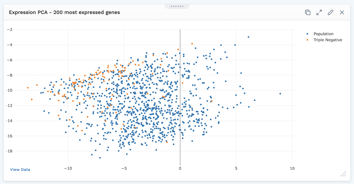
Users can map the genomic data from their project using a Gene Expression PCA plot.
After selecting the Gene Expression PCA Plot module to add to their layouts, users will be presented with a settings screen to specify what is mapped.
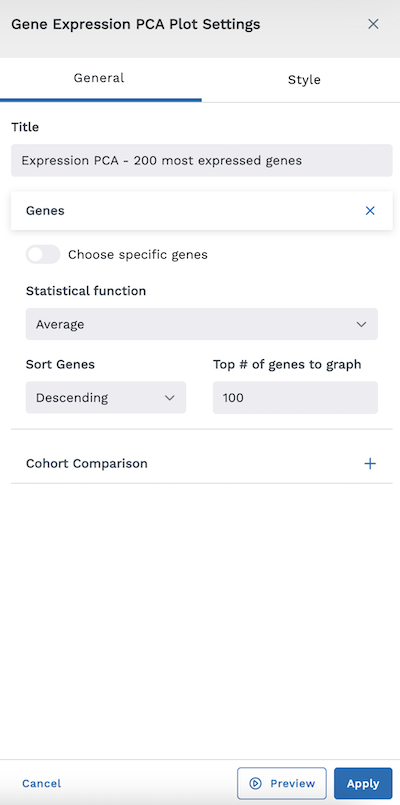
If you do not toggle "Choose specific genes" on, you will be asked to specify the following information:
- Statistical Function (Standard Deviation, Average, or Median)
- Sort Genes (Ascending or Descending)
- Top # of Genes to Graph
If you toggle on "Choose specific genes" (as shown below), you'll be asked to select which Plot Genes you wish to add to the map. You can add more by clicking the Add Gene button or remove a gene by clicking the X beside the selected gene.
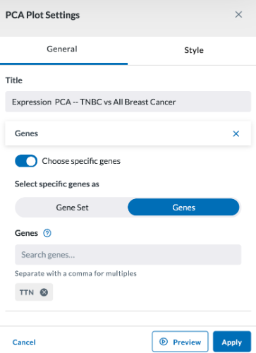
You may also compare cohorts by checking the "Compare to Cohort" checkbox, then specifying the cohort to compare (multiple can be selected by clicking the Add Cohort button.)
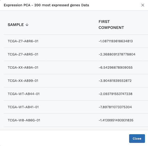
At the bottom left of the module, users can click View Data to display a chart with the plotted data.
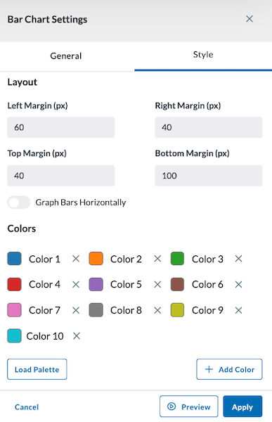
Style
The Style tab allows you to adjust the colors of your bar chart and select the margin size of your module. You can also load a palette for more color options.
Preview, Apply, and Save your new settings:
- Click Preview in the module settings to view it.
- If everything looks good, click Apply to apply the new settings. This will NOT save the module. If you click away, you will lose this module.
- To save this module and its settings to the layout, click the Save Changes icon found in the header at the top of the page. Or if you need to make changes, click the Edit icon in the top right corner of the module.
Clicking Apply will create your chart. It does not save the layout. To save the layout, you must click the Save Changes icon (found in the header). Navigating away from this page before clicking the icon will cause you to lose all changes since your last save.